B2C
Responsive Web
GriefShare is a program for support groups helping people work through the difficult emotions of grief. The groups go through a guided 13-week curriculum with videos and a participant workbook. Every participant must register using the Find a Group page.
The Challenge
Redesign the Find a Group page, keeping in mind that it is one of the most crucial and most visited pages on the website.
Design Question
How might we iterate on the current online experience in a way that helps people find the ideal group or event for themselves?
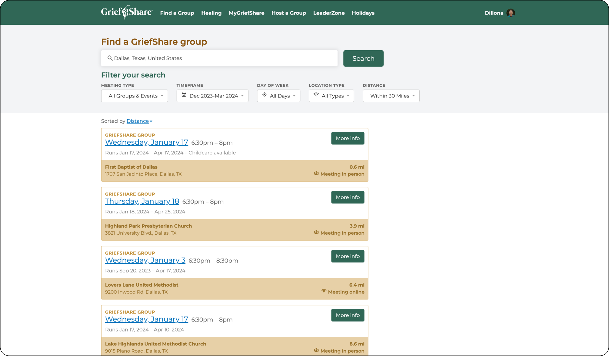
Before
After
RESEARCH
Discover
Currently, users must type in their location before being presented with a list of nearby groups and events. Then the search results did not have a clear visual hierarchy. It was unclear at this point what the motivating factors were for users and how they decided what group to ultimately register for.
Proto-persona
Before diving into the redesign, I needed a deeper understanding of the user’s motivations and goals. I developed 4 unique proto-personas for different user types, with the most relevant for Find a Group being the “Pre-Registrant”.
Design Audit
Before starting the redesign I needed to understand what already existed. I performed a design audit of the current Find a Group page that included an inventory of on-page components and accessibility check.
Qualitative Interviews
Proto-personas on their own were insufficient to inform design decisions. In order to gather more data from actual people that were pre-registrants a research plan was created to conduct qualitative interviews with users that had completed the GriefShare program.
The purpose of the interviews was to better understand the decision making process for users looking for a group. I presented each participant with a list of criteria and asked them to rank them in order of importance for how they chose the group they attended.
These insights would help inform the redesign of the page, from the order of the filters to the information presented on group and event cards, and any potential new features.
I conducted 7 interviews for this specific research question but transitioned the effort into continuous discovery with the aim of weekly qualitative interviews.
*Interview information anonymized for this case study
DEFINE
Insights
User interviews revealed information about their motivations and decision making criteria. These key insights were summarized into three main takeaways.
Schedule
A convenient meeting schedule (day of week and time of day) is the most important criteria when deciding on a group for 50% of interviewees.
Format
If the meeting format (in-person or online) matters for a participant then it becomes their most important criteria.
Distance
Even though distance was never ranked first or second, the majority of participants cited looking for a group near their home or work.
IDEATE
Wireframes
The qualitative interviews validated some assumptions regarding the importance of schedule and location. This helped to inform how to present the filters as well as details on the cards themselves.
Additionally, given the importance of distance I decided to brainstorm options for a map feature to allow users to visually find groups and events near them.
PROTOTYPE
Mockups
The Solution
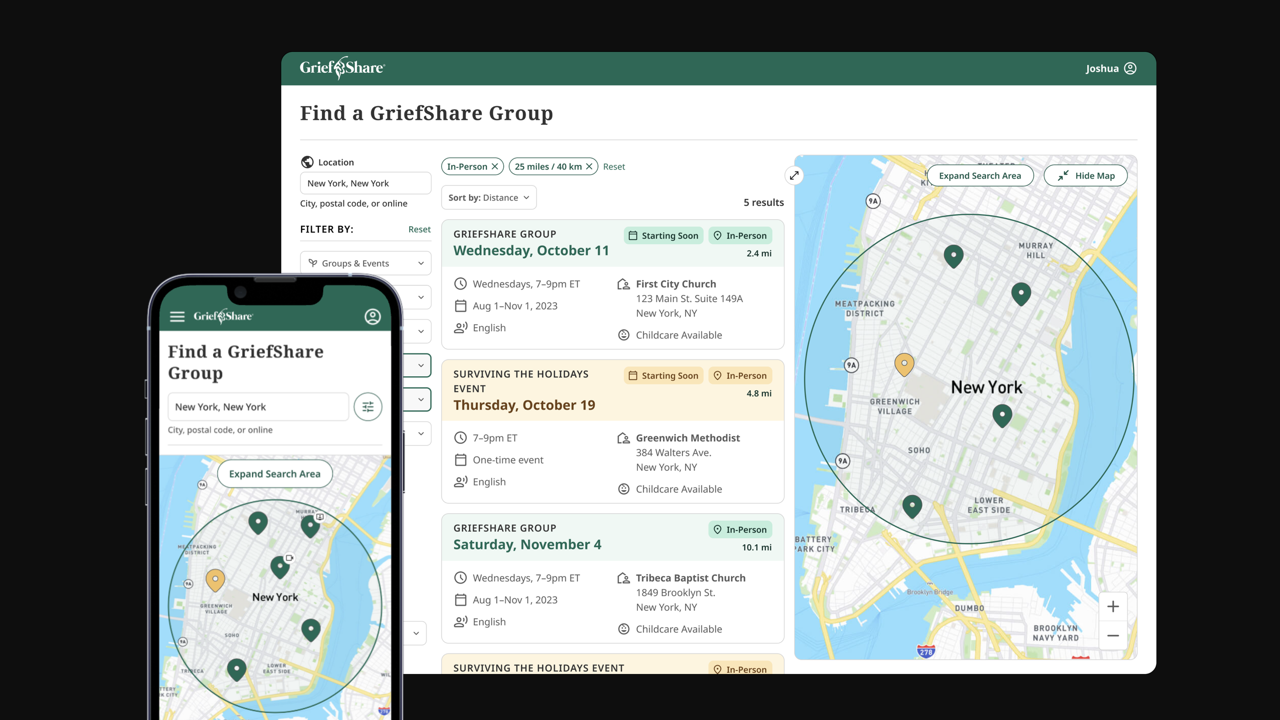
Thanks to the input of users and multiple ideation sessions, a complete overhaul of the Find a Group page was finally completed. I moved the filters to a vertical alignment to make it easier to scan. The cards were redesigned with a top to bottom visual hierarchy, passing accessibility criteria now as well. I also added a map with the ability to search within a given radius. The page is fully responsive, unlike the previous version.
Immersive Map
For the visual processors an immersive map view is now available to help users see the distance instead of only reading it.
Card Only View
The Find a Group page adapts to the preferences of the user by hiding the map if they want a more traditional view with cards only.
CONCLUSION
Reflection
User Feedback is Essential
The importance of speaking to actual users cannot be understated. There are many behaviors in the real world that are not considered in the controlled environment of the design file. Additionally, design decisions are just assumptions until they are validated by users.
Read Between the Lines
What a person says may not always align with what they do, that’s just part of being human. It’s just as important to ask what a user would like as it is to ask how they actually tried to do something.
Understand Team Constraints
Given the scope of this redesign and developer bandwidth, many of the new features were scaled back for a MVP, opting for iterating on the current design instead of a complete overhaul. The effort wasn’t wasted, though, as we now had an end goal to work toward.


