GriefShare
GriefShare's Find a Group page was the mission-critical entry point to the entire support experience. I redesigned the search journey and introduced the organization's first formal UX research practice, changing how the team learned from users beyond the project itself.
At a Glance
The Mission-Critical Entry Point
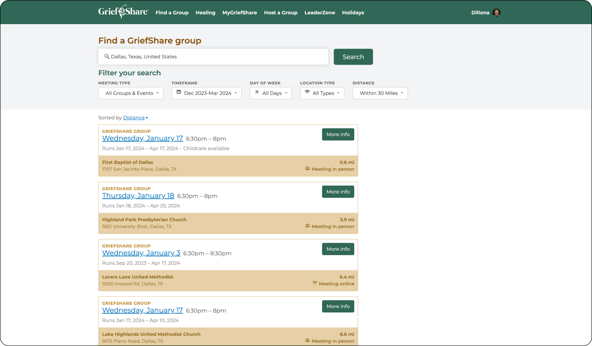
Find a Group was the most important page on the GriefShare website. Every support group participant started here, and the group experience was the product. If someone could not find a group that felt reachable, trustworthy, and compatible with their life, the organization failed at the moment it most needed to help.
Product Question: How do you improve a conversion path where finding the right group, or failing to, has real human consequences?
The Organizational Gap
The page had been built on untested assumptions. Visual hierarchy, accessibility, and the rise of online groups after COVID had all created gaps the original design was not built to handle. But the deeper issue was that Church Initiative did not yet have a formal way to learn from users before making product decisions.
Mission risk
The page was the bridge between someone seeking help and the support group experience. Search friction was not just a usability problem, it could prevent someone from joining a group.
Assumption risk
The team had strong instincts about what mattered, but limited direct evidence about how people in grief evaluated group options before committing.
Capacity risk
As a non-profit team, engineering bandwidth was limited. The work needed to identify what should ship now while preserving a larger validated direction.
Building the Research Practice
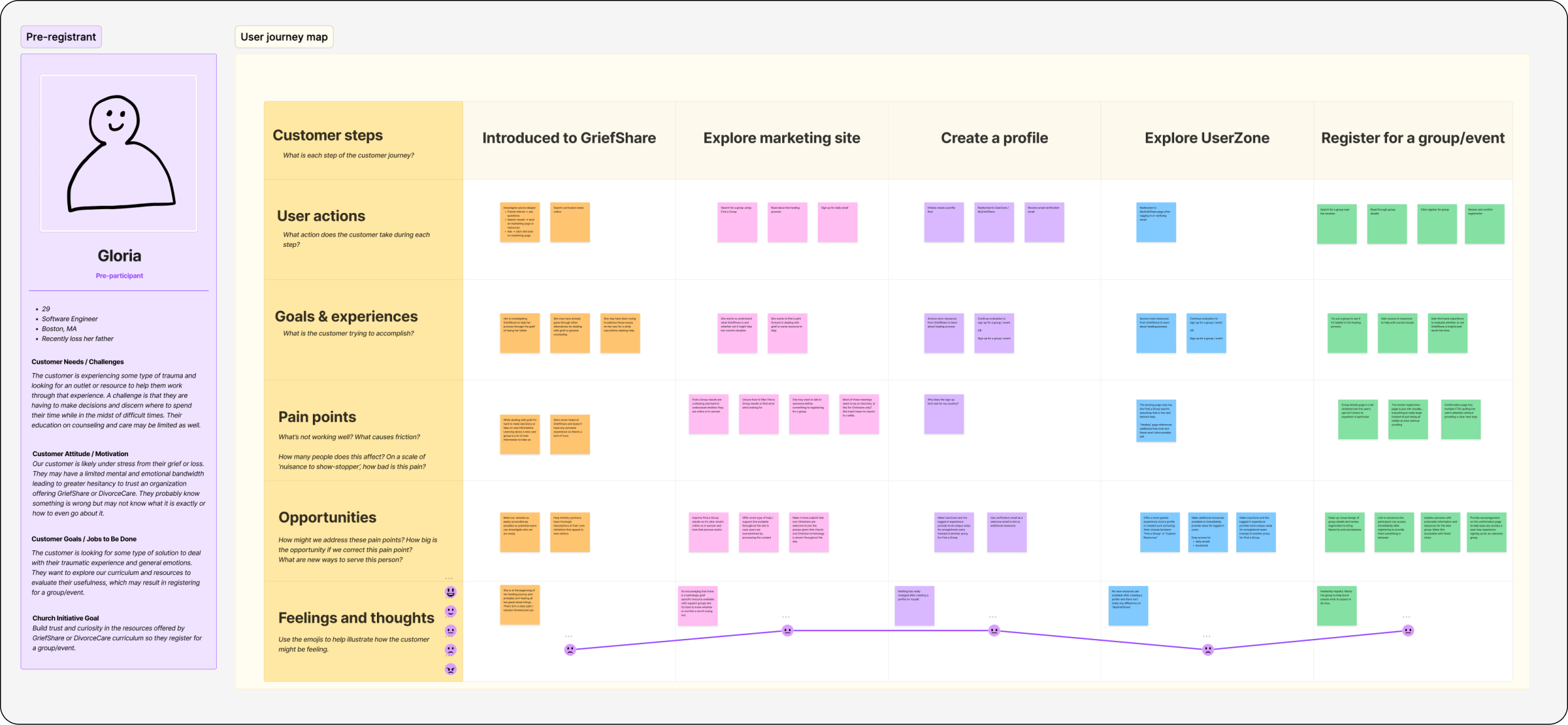
Church Initiative had no formal UX research practice when I started this project. I introduced one. Beginning with a design audit and proto-personas, I ran seven structured interviews before transitioning into a weekly cadence of ongoing user conversations, all conducted solo. The goal was not just to improve one page, but to give the organization a repeatable way to make product decisions from evidence.
Proto-persona
Before diving into the redesign, I needed a deeper understanding of who was using Find a Group and why. I developed four proto-personas for different user types. The most relevant for this project was the Pre-Registrant: someone in grief, evaluating options, trying to find a group they could trust before committing.
Design Audit
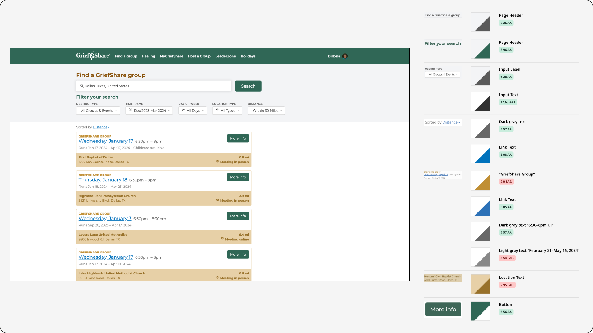
Before starting the redesign I needed to understand what already existed. I performed a design audit of the current Find a Group page that included an inventory of on-page components and an accessibility check, surfacing gaps in contrast, hierarchy, and responsive behavior.
Qualitative Interviews
Recruiting participants required careful thought. GriefShare serves people processing real loss, so I spoke only with participants who had completed a group within the past year: close enough to remember the experience clearly, but far enough along not to disrupt their grief process. I sent an initial feedback form to surface interested participants, then scheduled batches of interviews from that list. Seven interviews led into ongoing weekly discovery conversations.
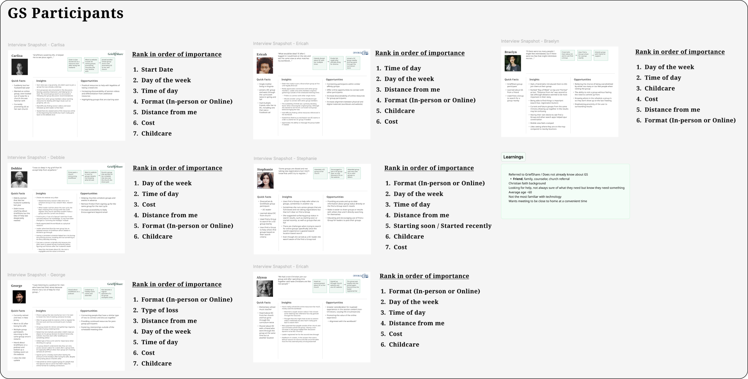
Key Insights
Schedule
A convenient meeting schedule (day of week and time of day) is the most important criteria when deciding on a group for 50% of interviewees.
Format
If the meeting format (in-person or online) matters for a participant, it becomes their most important criteria. Online groups had grown significantly and were hard to find in the existing interface.
Distance
Even though distance was never ranked first or second, the majority of participants said finding a group near their home or work was important to them.
Ideate
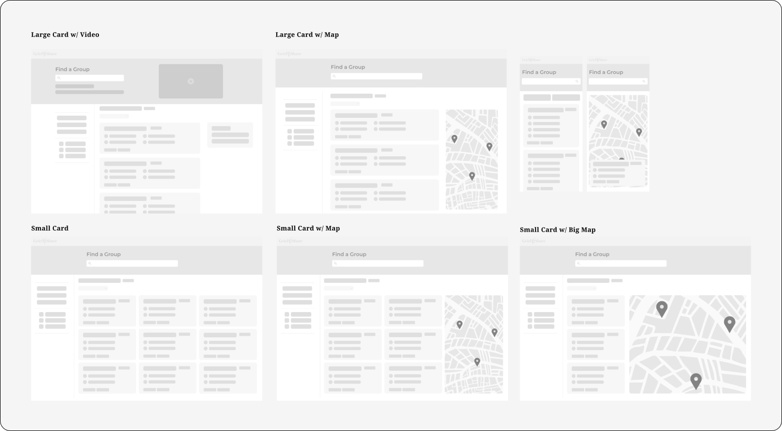
The Redesign
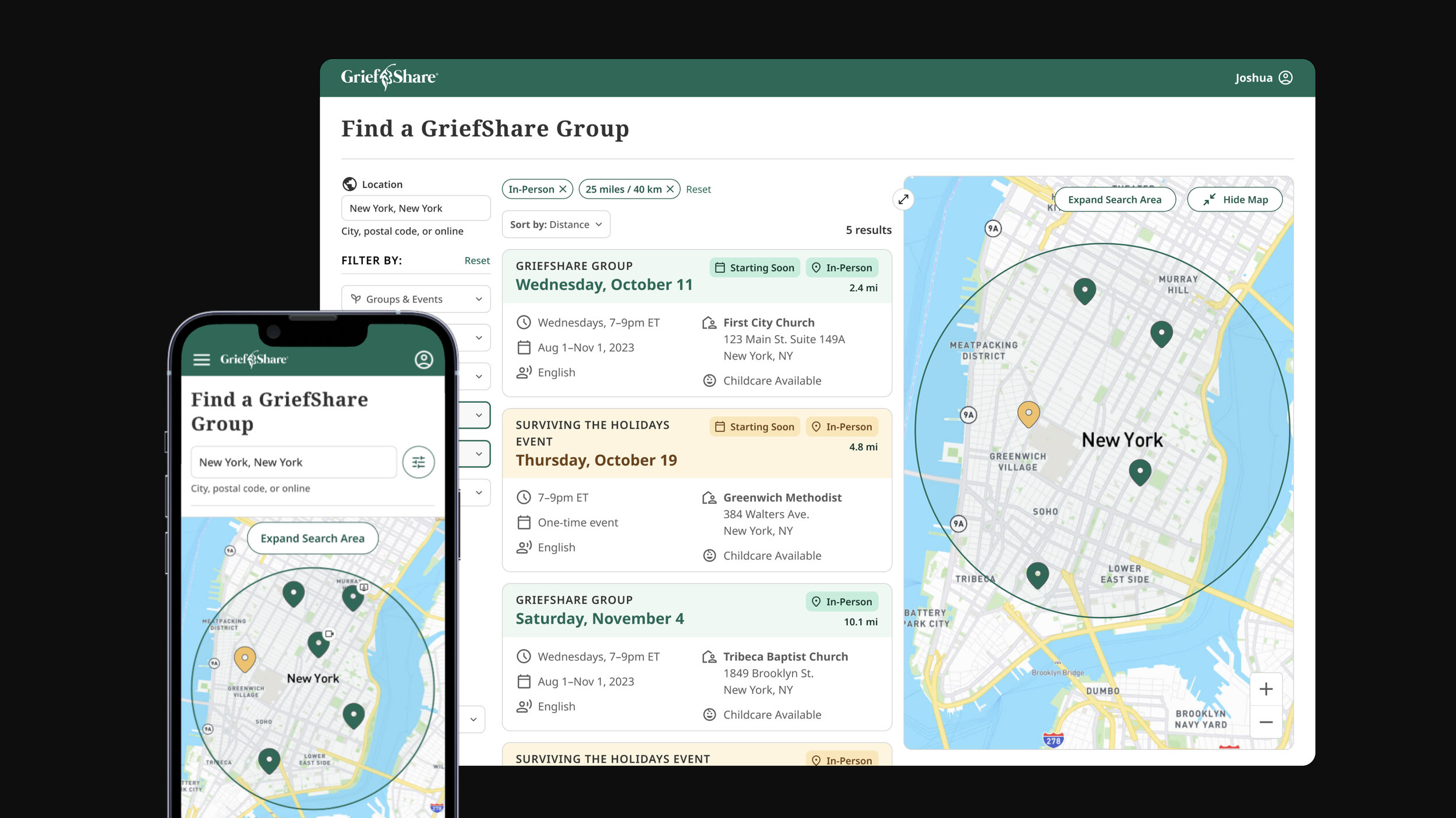
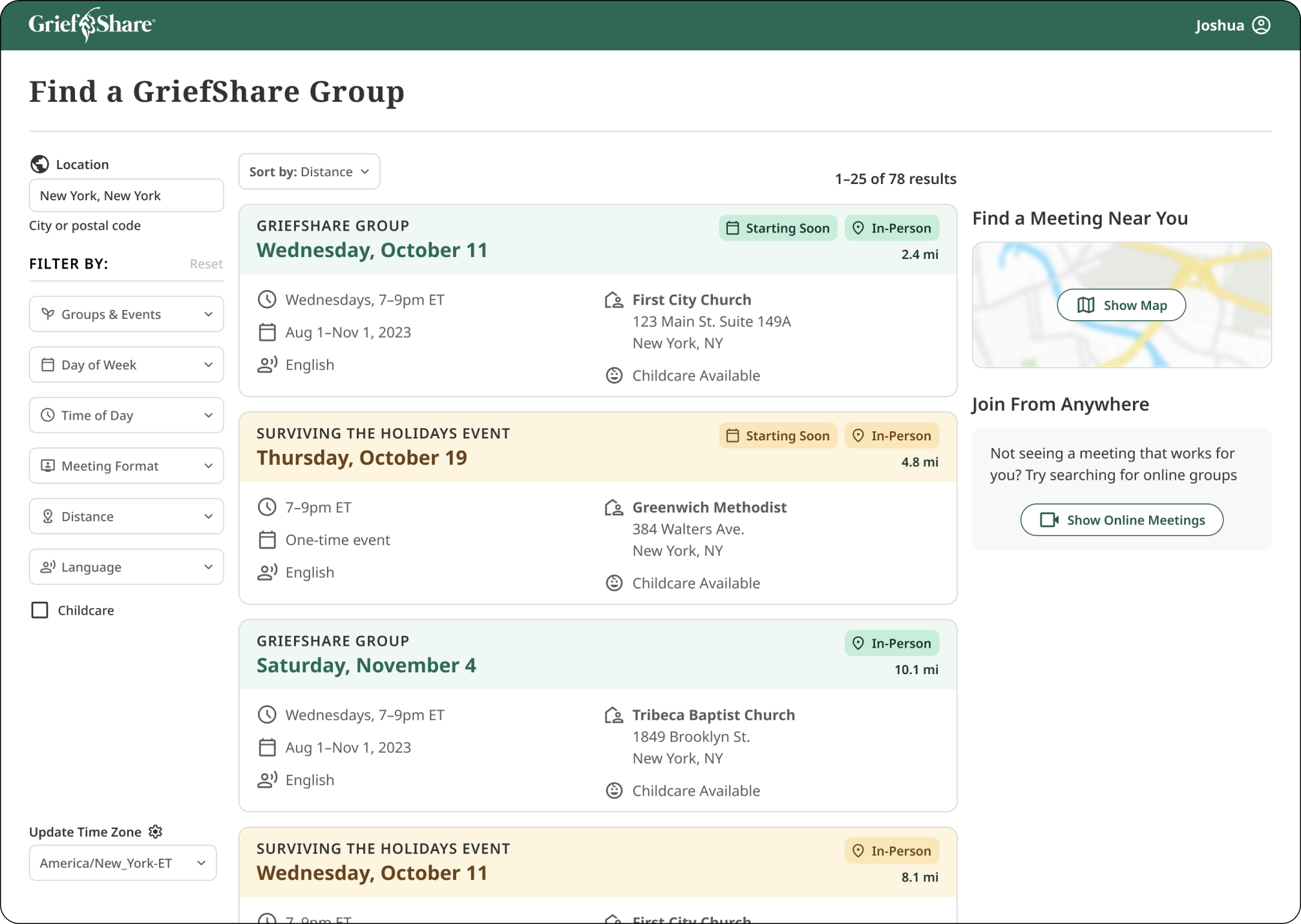
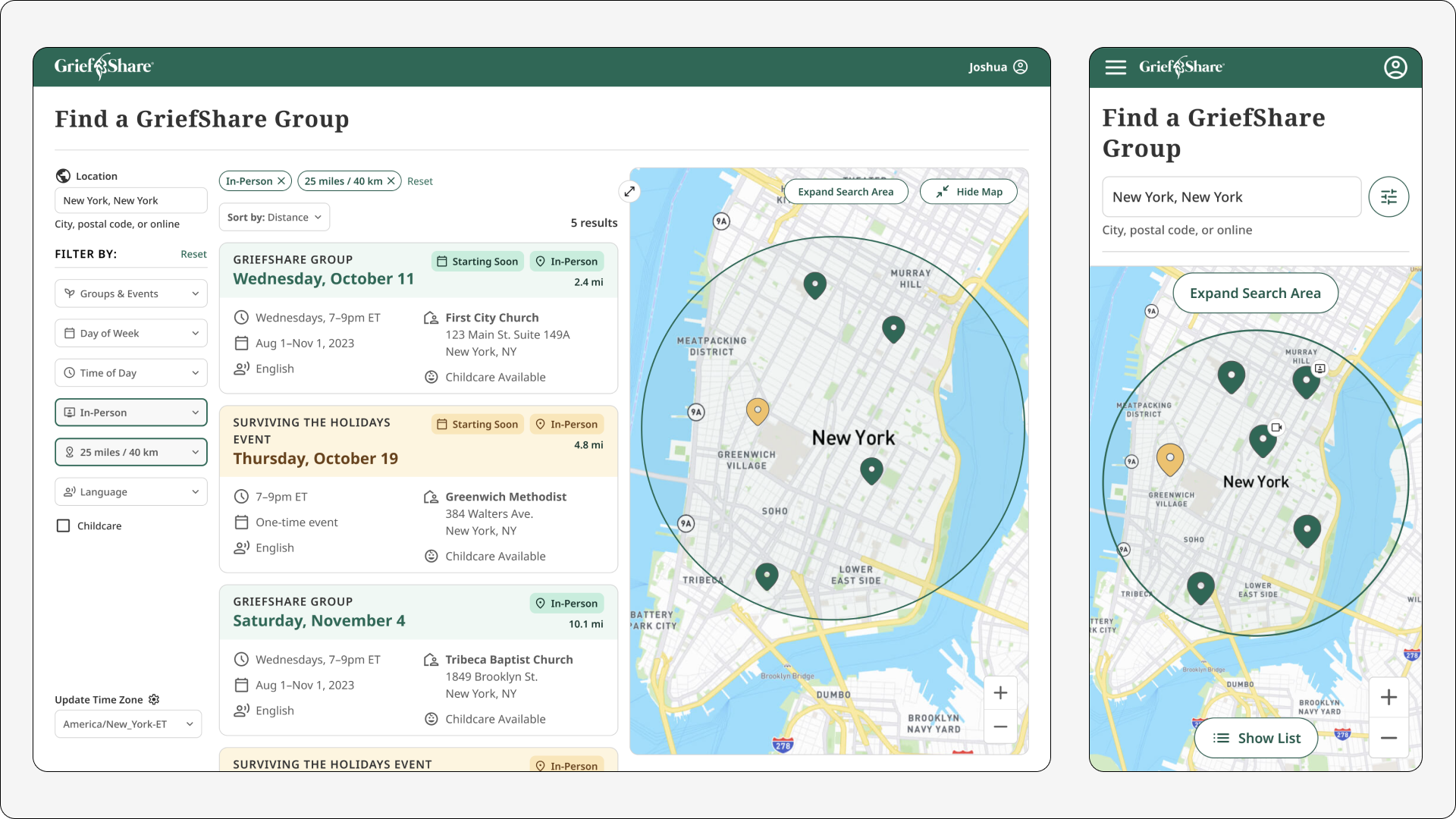
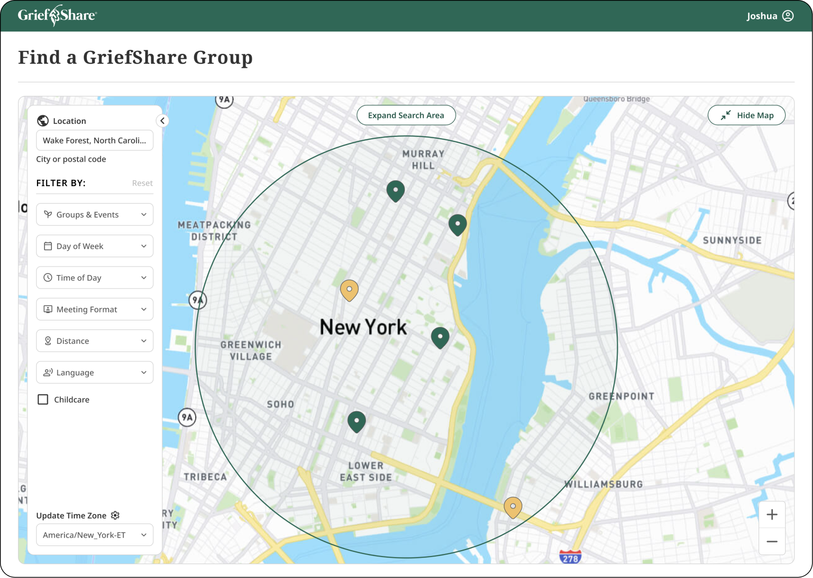
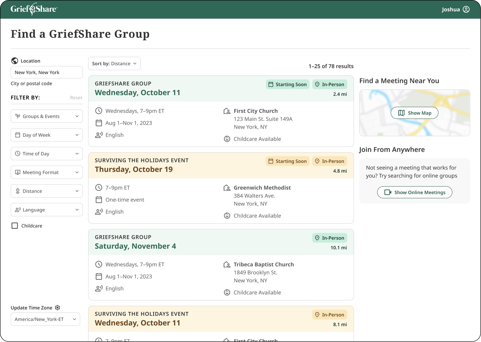
The redesign prioritized changes with the most immediate impact on someone choosing a group: reordered filters, clearer meeting details, contextual tags, and accessibility fixes throughout. The map view was designed and validated with users, but held back from the initial release given development bandwidth at a non-profit. The release improved the baseline experience while preserving the larger direction.
Shipping the Right Slice
The strategic decision was not simply choosing the best concept. It was separating what mattered most now from what should guide the product next. Research showed the map could improve proximity decisions, but the card view could ship sooner with the schedule, format, distance, and accessibility improvements users needed immediately.
Immersive Map
Designed and validated with users as a way to understand proximity visually rather than reading it. It did not ship in the initial release but remains the direction to build toward.
Card View
The baseline experience, rebuilt with improved hierarchy, reordered filters based on research priorities, and contextual tags that surface the details most relevant to someone choosing a group.
Organizational Impact
The lasting outcome was larger than the redesigned page. The project introduced a new operating rhythm for discovery at Church Initiative, giving the team a way to continuously learn from the people it served.
Research became a practice
Structured interviews and weekly user conversations continued beyond the redesign, creating a standing channel for product learning.
Evidence shaped prioritization
Research clarified which search criteria mattered most, helping the team prioritize immediate improvements while keeping the map experience as a validated future direction.
Ethical recruiting standard
The research approach balanced the need for honest feedback with care for participants, focusing on people who had completed a group recently rather than those actively processing fresh loss.
Mission alignment
The redesign connected product decisions back to the organization's core mission: helping people find a support group they could trust enough to attend.
Reflection
Research design is design
The most careful design decision on this project was not the UI. It was how to recruit participants. Choosing to speak only with people who had completed their group recently, rather than those still in grief, was an ethical call that made the research more honest and the findings more trustworthy.
Introduce the practice, not just the project
The most lasting contribution was not only the redesigned page. Starting a weekly rhythm of user conversations changed how the organization thought about its product. The research practice outlived the project and stayed alive as long as I was in the role.
Ship what's possible, keep the vision
Non-profit bandwidth meant a smaller initial release. The discipline was designing the full vision first, then deciding what shipped now and what stayed as the direction to build toward. The map did not ship. The direction it set did.