Deposify
Deposify had market validation, but its product story was hard to see: renters and property managers were sharing one interface built around two very different jobs. I helped split the product into clearer customer experiences, creating the redesign mockups the founders used to pitch and sell the company.
At a Glance
The Business Challenge
Deposify had proven there was market demand for deposit management, but the product had not yet made the business easy to understand. Renters and property managers were sharing one interface, even though one group needed a fast payment path and the other needed an operational platform. The same UI was a ceiling on both adoption and buyer confidence.
Product Question: How do you make a validated product legible enough to scale, sell, and invest in?
Making the Business Legible
The redesign was not just a modernization effort. It clarified what Deposify actually was: a simple payment experience for renters on one side, and a multi-property financial operations platform for property managers on the other. That separation made the product easier for users to navigate and easier for buyers to understand.
Renter conversion
Renters had one primary job: pay the deposit. Anything that made the interface feel like admin software created unnecessary friction at the point of conversion.
Manager operations
Property managers needed a command center for units, payments, reporting, tasks, and bank accounts across properties, not a lightly expanded renter flow.
Buyer confidence
Separating the experiences made the product vision easier to evaluate, showing both immediate user clarity and a path toward a larger operational platform.
Two Products in One
The solution was to split the app into two distinct experiences, each designed from scratch for its user type. The property manager side became a full operational platform; the renter side became almost aggressively simple. That product split became the story the company could show to customers, investors, and eventual buyers.
The Renter Experience
Renters have one job: pay their deposit. The redesign stripped everything back to make that as frictionless as possible. Rental agreement details and direct messaging to the property manager are available, but the primary screen is just a payment screen. The experience was designed for conversion, not administration.
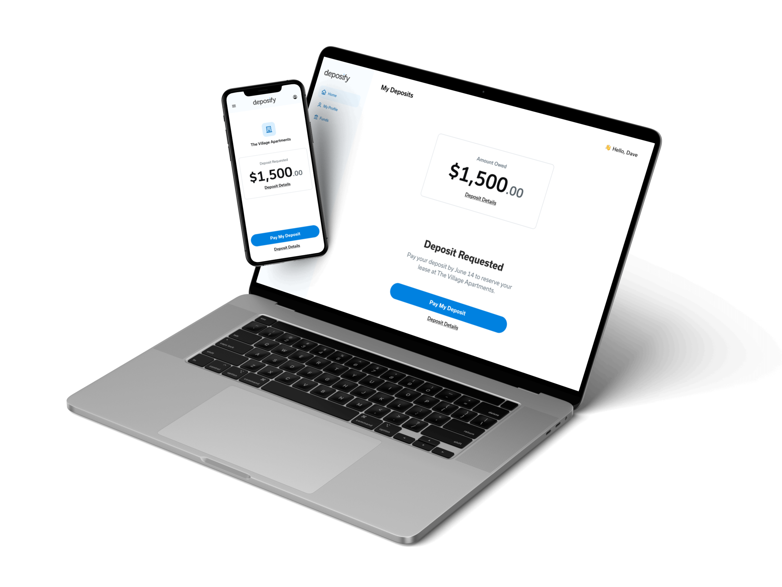
Simplified Payment Screen
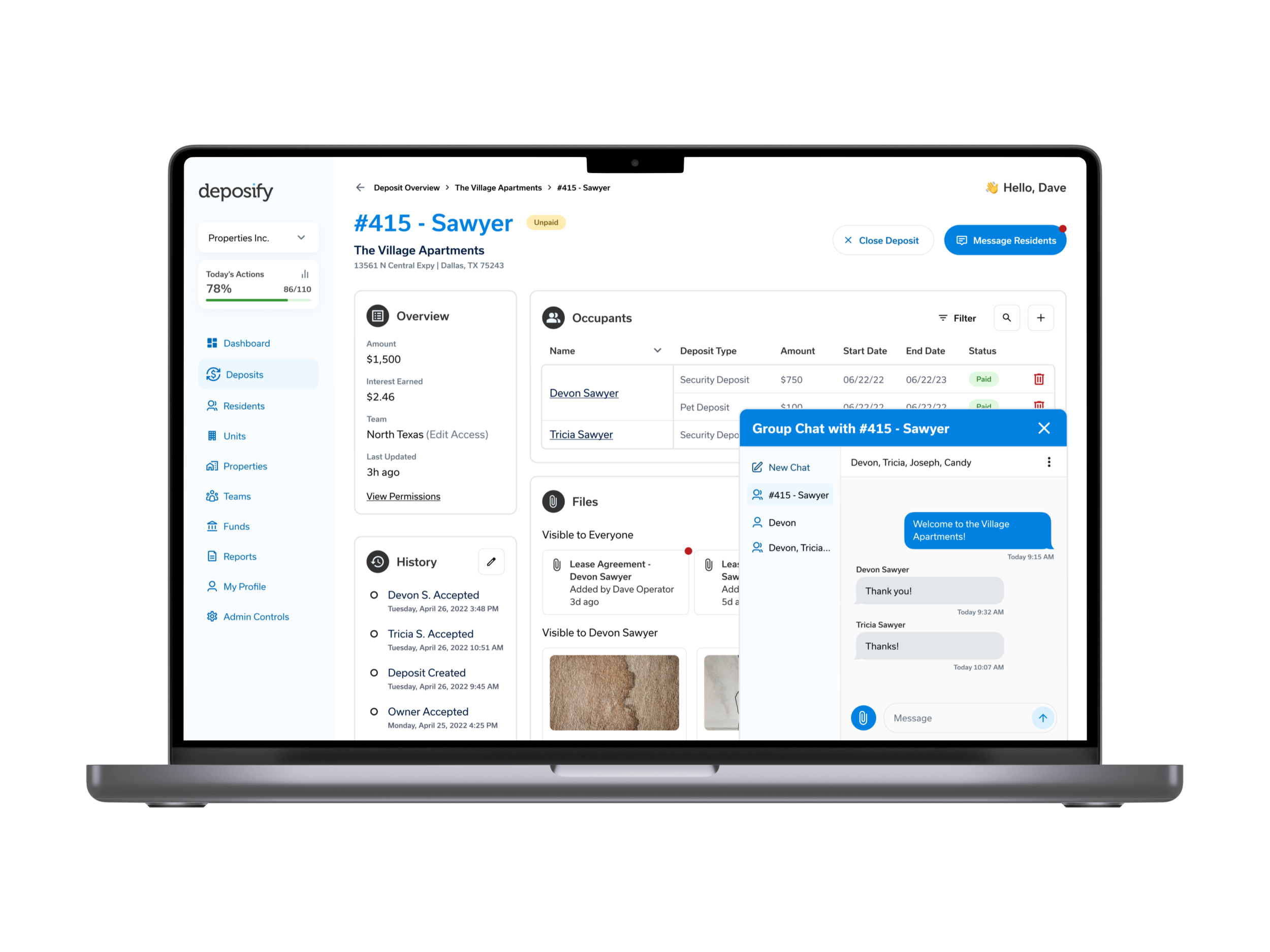
Direct Messaging with Property Manager
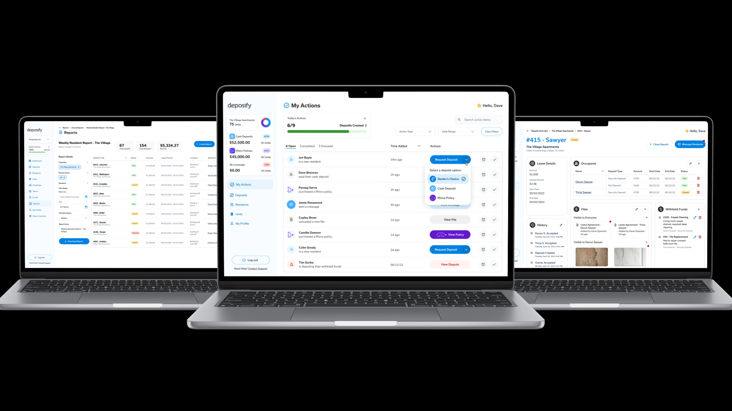
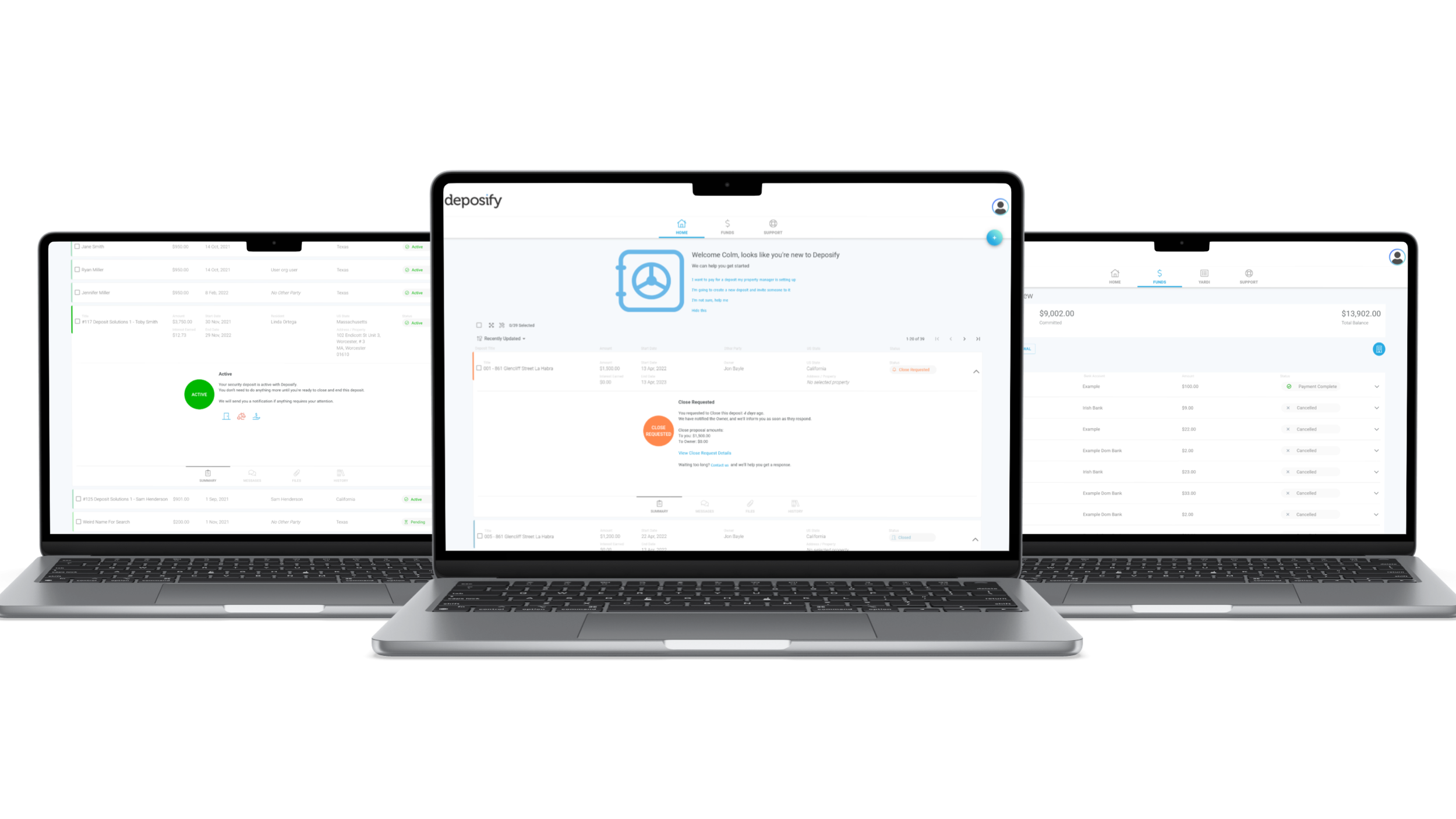
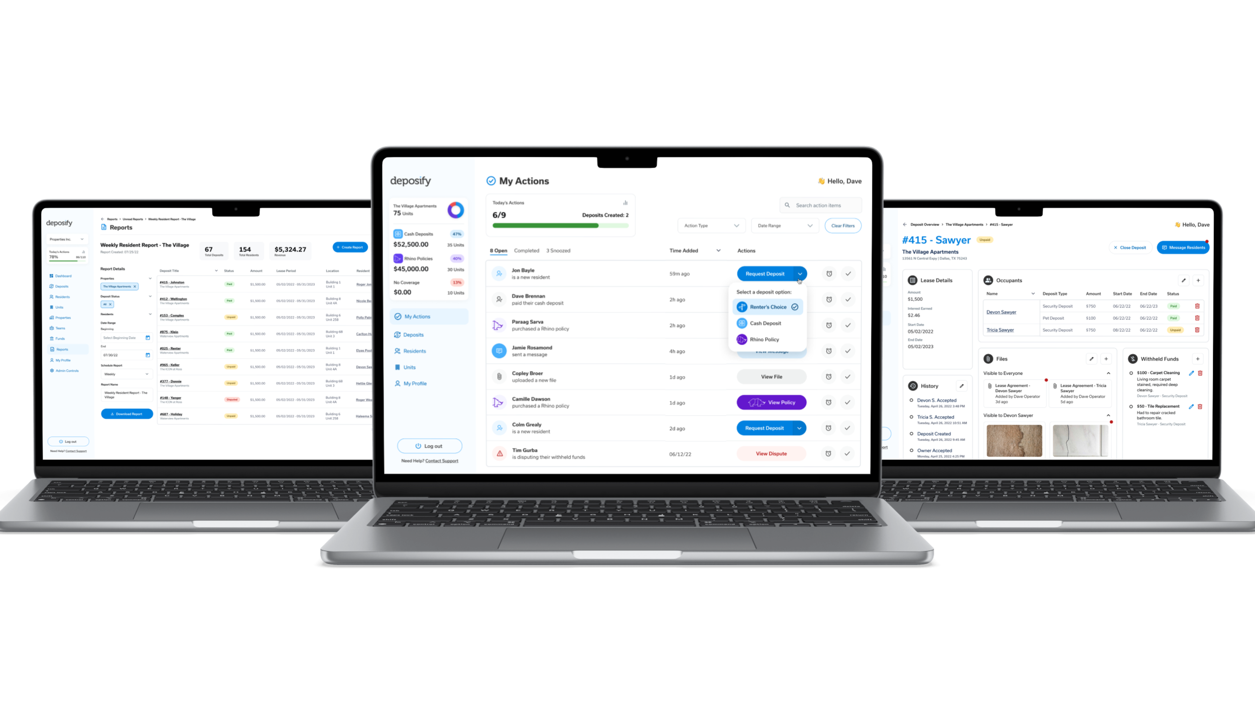
The Property Manager Experience
Almost everything on the property manager side was net new, with little to reference in the existing product. The most demanding design problem was task management: a multi-property admin view that lets managers assign and track tasks across individual team members at each property. This side of the product had to communicate operational scale.
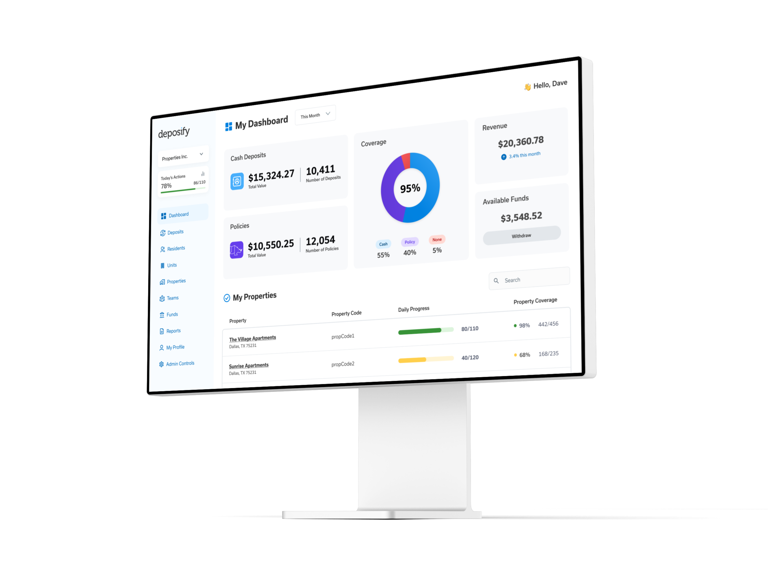
Multi-Property Dashboard
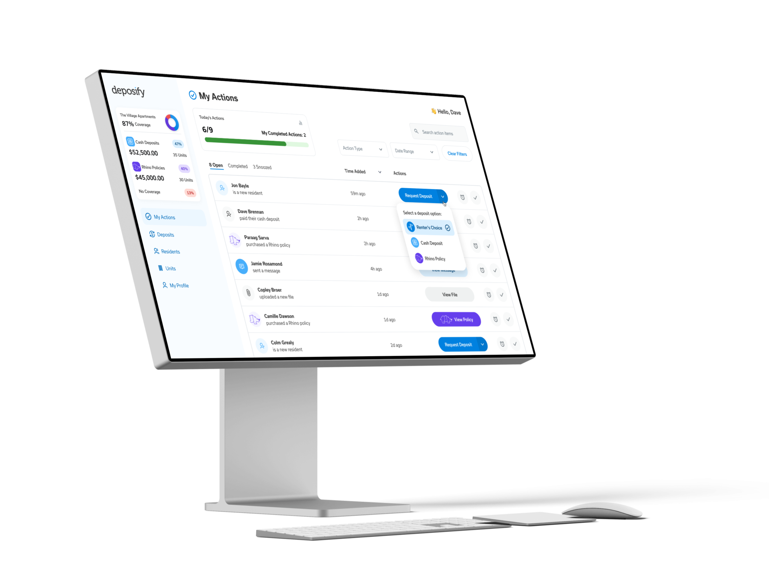
Task Management Across Properties
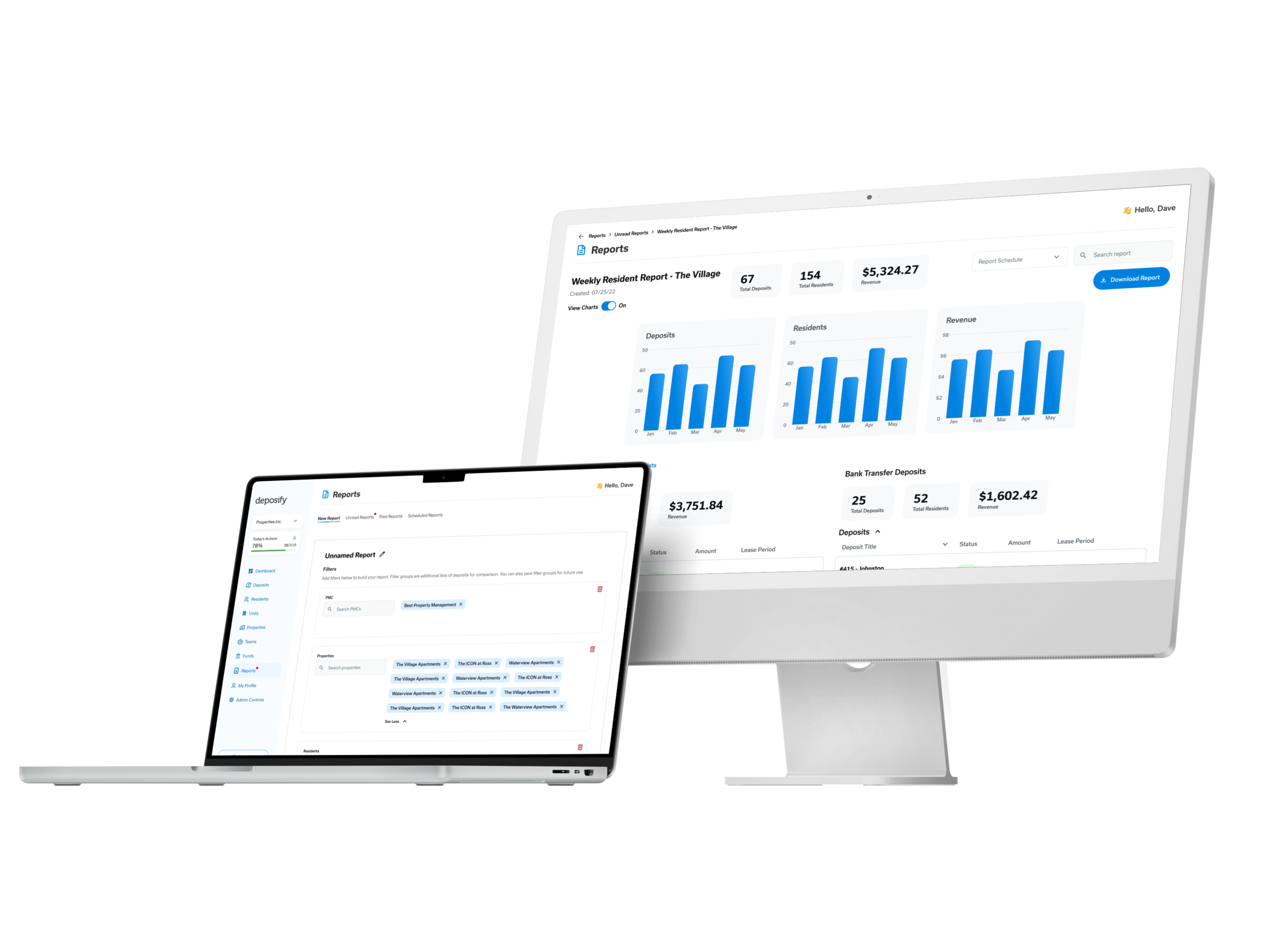
Custom Reports
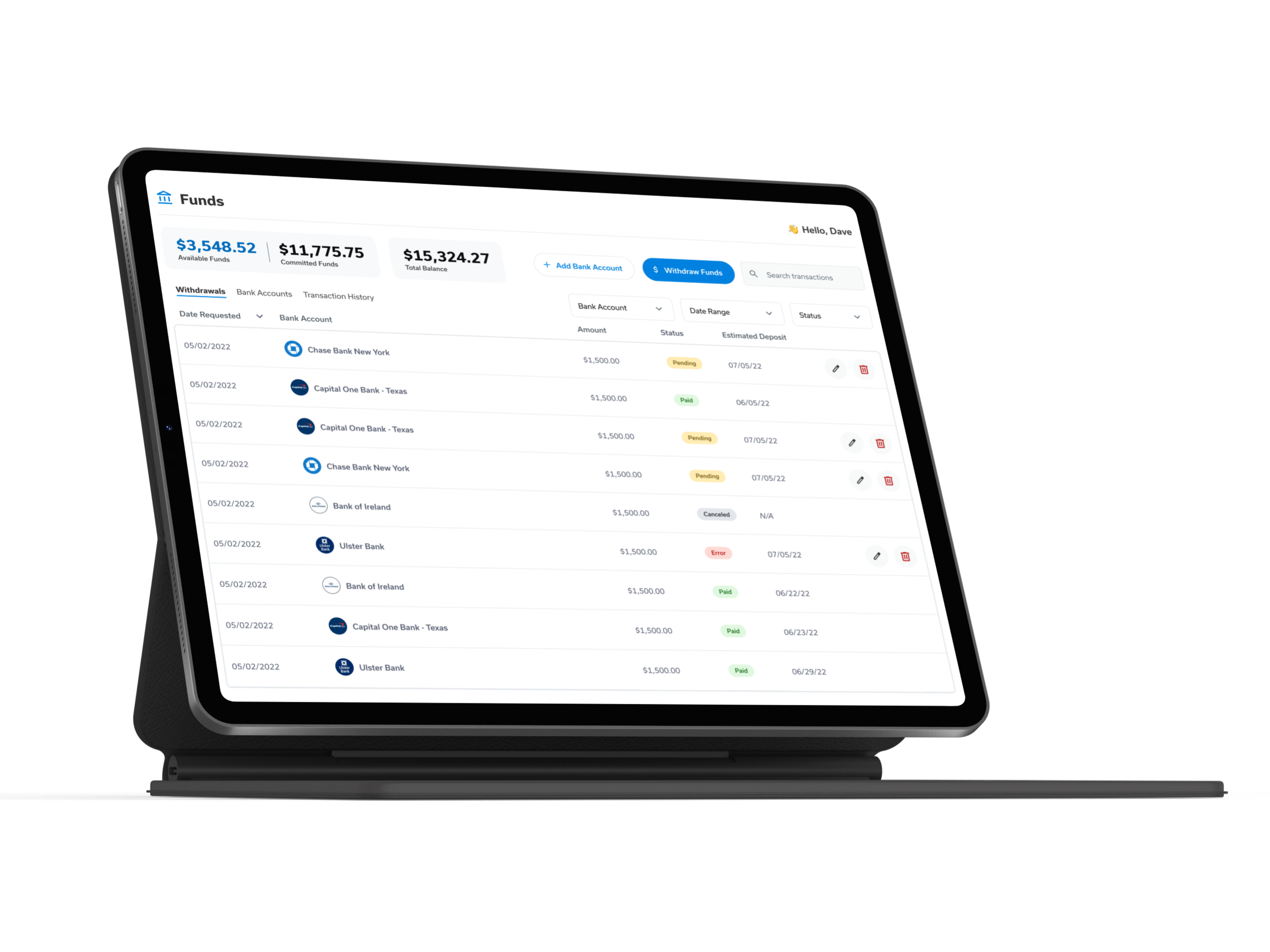
Bank Account Management
The Outcome
Development had just begun when the client told us they had sold the company. They had been using the redesign mockups to pitch potential buyers, and the designs were the main selling point alongside the technology. Deposify was acquired twice in 2022, ultimately by Rhino as part of a multimillion-dollar deal. Work made to improve a product became the visual case that made the business believable - twice.
Reflection
Question the assumption, not just the interface
The CTO had not made a design mistake. He had made a product assumption: that both user types needed the same experience. Redesigning the UI without questioning that would have missed the business problem entirely.
Simplicity is also a design decision
The renter experience required as much thought as the property manager side. Deciding what to remove, what to hide, and what to surface as the single primary action is harder than designing a complex screen.
Design communicates what a product could become
The mockups closing an acquisition they were not made to close was the clearest signal of the project: a well-designed product does not just show what it is, it shows what the business is capable of becoming.