LeadSuite
LeadSuite is the flagship investigative platform at LeadsOnline. I turned a vague ask to make a legacy interface easier to use into a scalable product foundation, redesigning the core person and case workflows that now support over half of platform traffic.
*This work involves sensitive law-enforcement investigations, so I can't share full details publicly. These visuals are representative of the live product, and I'm glad to walk through the complete case study and design decisions in conversation.*
At a Glance
The Product Challenge
LeadSuite was the flagship platform, but its core workflows were still shaped by a low-adoption legacy product. The interface had been reskinned without rethinking how investigators actually move through people, cases, evidence, and leads. The risk was not just poor usability. The product needed a structure that could support daily use, new data sources, and the next generation of AI-driven workflows.
Product Question: How do you turn a dense legacy interface into a scalable foundation for the flagship investigative platform?
From Vague Ask to Product Foundation
The initial brief was simple: "make it easier to use." I used a UX audit and team facilitation to turn that directional ask into a product model the team could build from. The work became less about reorganizing screens and more about defining durable places for the product to grow.
Clarified the model
The person profile needed to become a structured hub for cases, associates, activity, and background data instead of a single page where every fact competed for attention.
Created room for growth
The case detail needed distinct views for summary, spatial-temporal analysis, evidence, and leads so future capabilities could be added without collapsing back into a wall of data.
Aligned the team
Audit findings gave product and engineering a concrete way to discuss tradeoffs, turning vague requirements into specific, buildable decisions.
What We Were Up Against
Wall of noise
The person profile loaded every data point simultaneously with no visual hierarchy. Investigators had to scan the entire page to find what they needed, with no tabbed structure, no grouping, no clear entry point.
Hard to follow, harder to discover
The original timeline and map design required cumbersome dual-axis scrolling to navigate. Enough functionality was buried or unclear that investigators, including me during the audit, were missing it entirely.
Vague requirements
PM asks were directional, not defined. I used the audit findings as a foundation, then facilitated team discussions to translate broad concerns into specific decisions about navigation, hierarchy, and product structure.
Person Profile
The person profile became the clearest proof point for the new product structure. I introduced a tabbed model - Cases, Associates, Activity Log, and a new 'Deep Background' tab - that gives investigators a direct path to the information they need while giving the product team durable places to add new data sources.
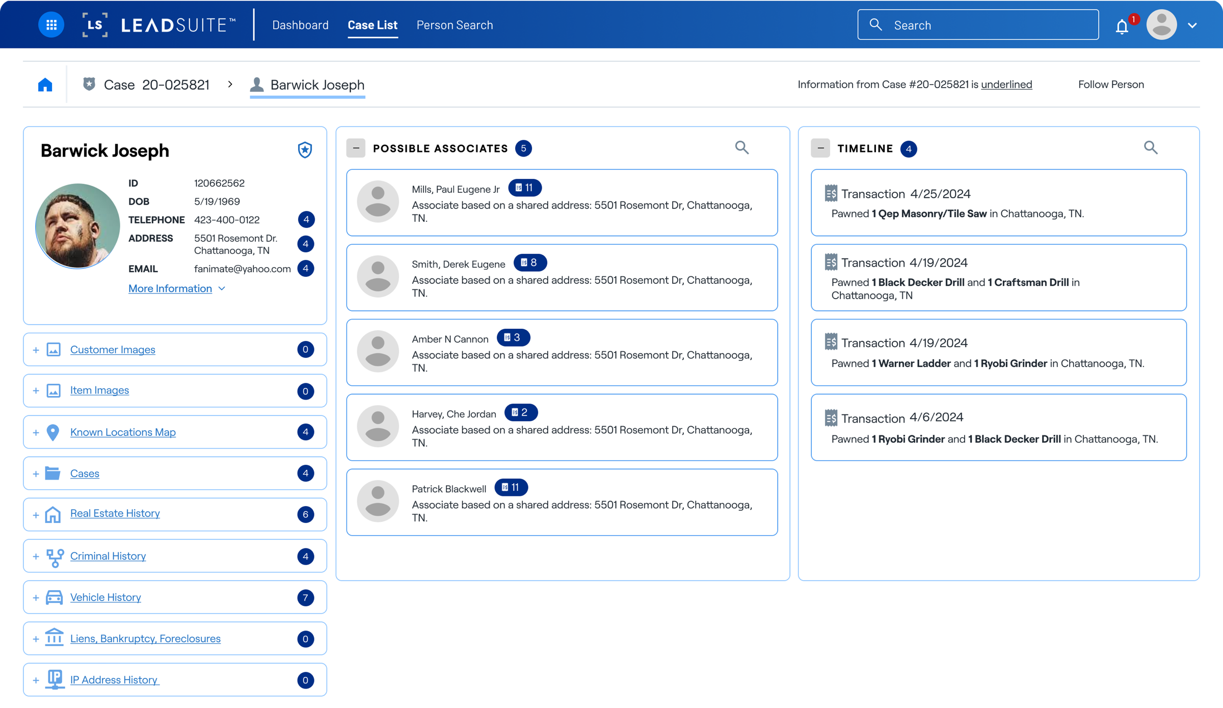
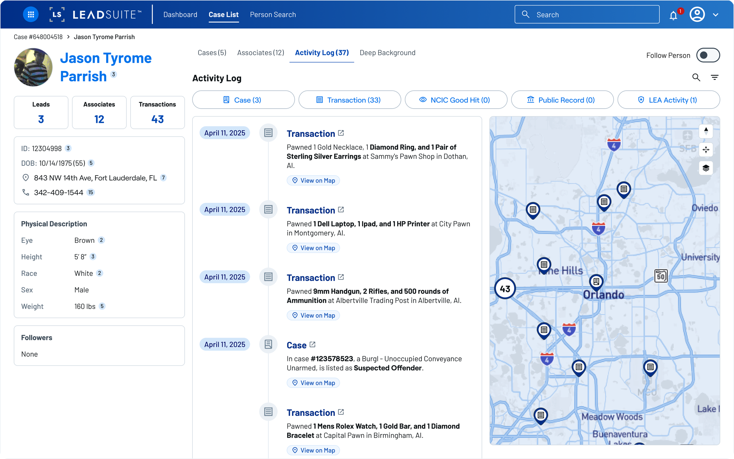
The redesigned person profile now drives over 50% of all traffic in the app.
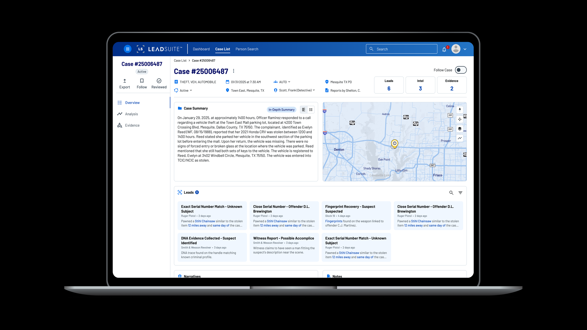
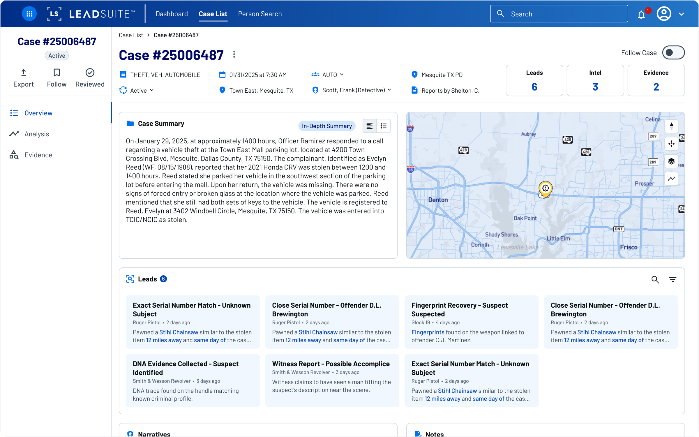
Case Detail
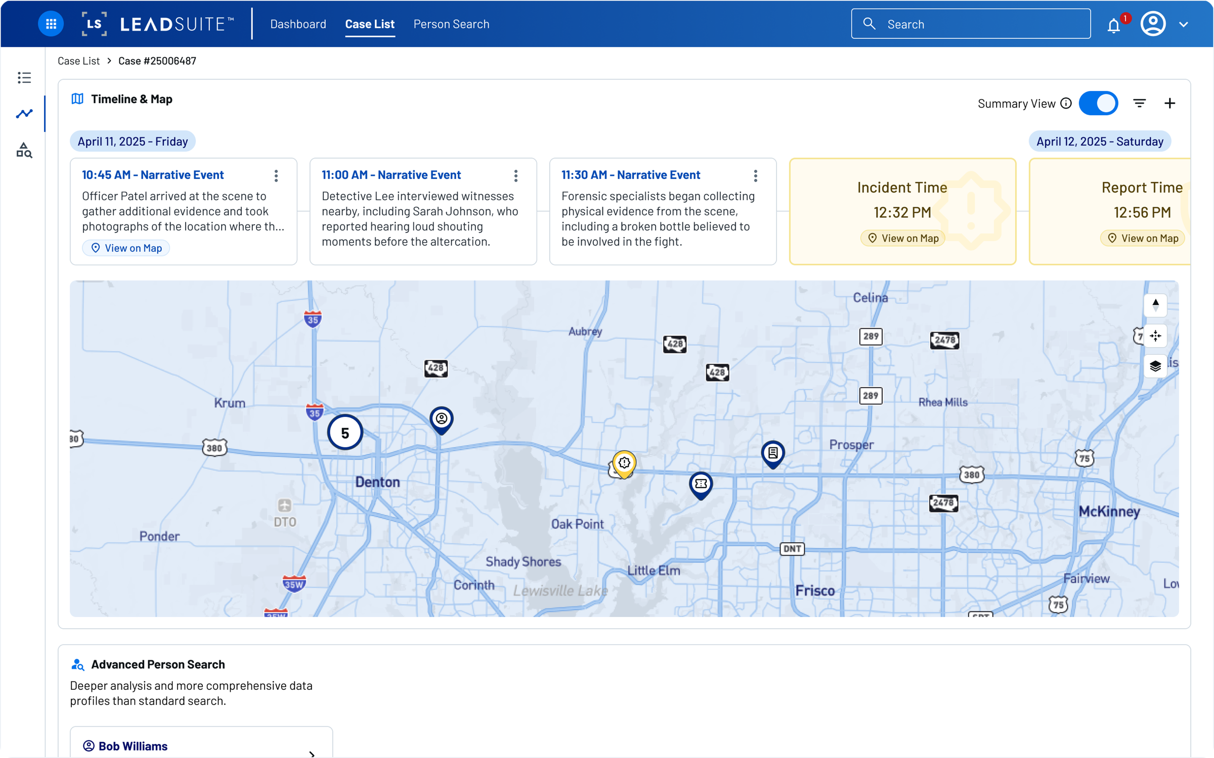
The case detail page is where investigators spend most of their time, so it needed to work as an operating surface, not a report. I restructured it around a vertical navigation with distinct views: an overview with the case summary and map, a timeline and map view for spatial-temporal analysis, and an evidence tab. Each view supports a different mode of investigative thinking without cluttering the others.
Timeline + Map
I redesigned the timeline as a full-width horizontal view, synced to the map, so investigators get two representations of the same facts for two different ways of thinking through a case. Events scroll chronologically left to right, and selecting one highlights its location on the map below.
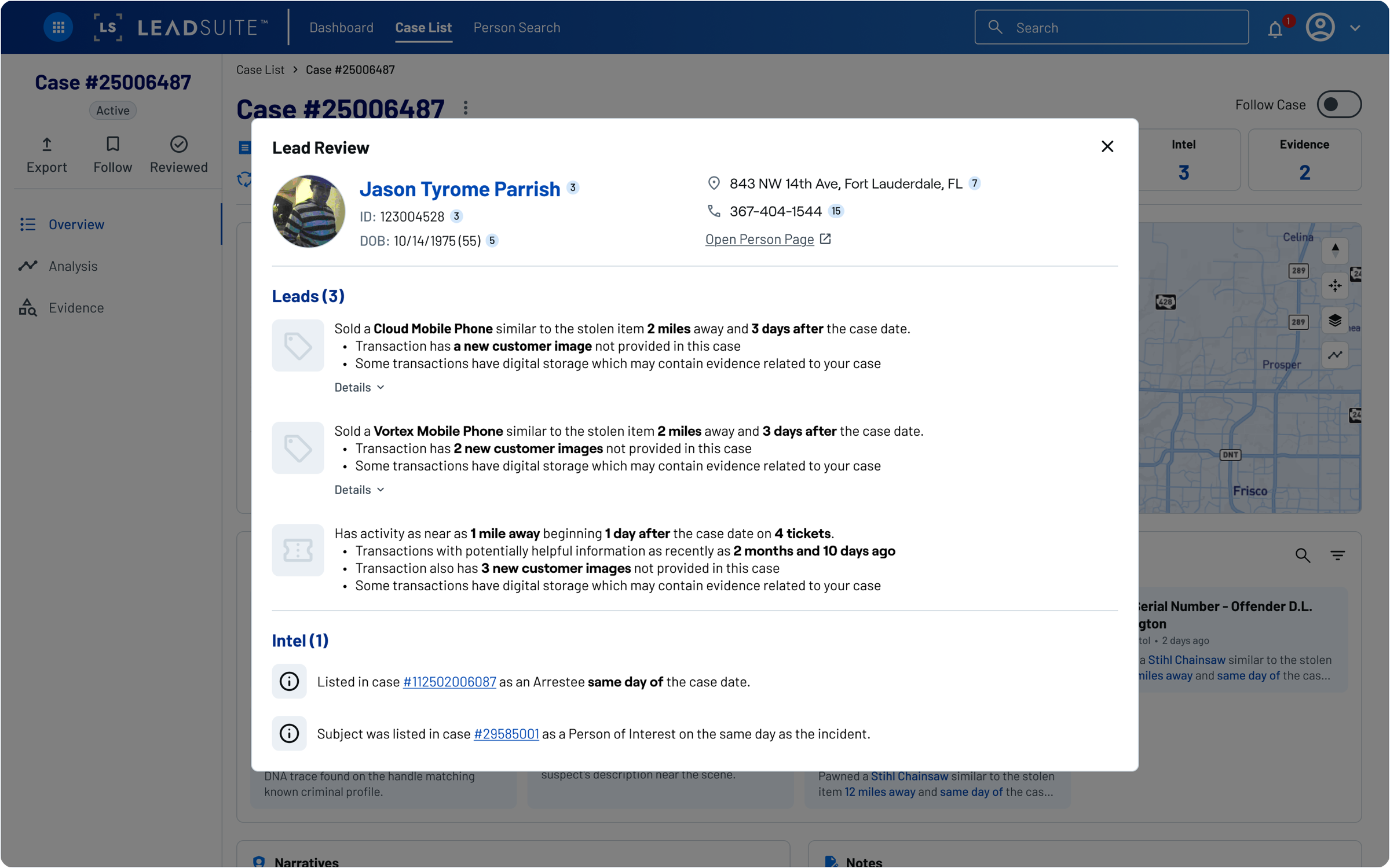
Leads
Leads is a net new feature, built in close collaboration with one of the developers. He brought the concept, and we workshopped it together until it became a focused workspace where investigators could track threads tied to a case, separate from the raw data views. It's designed to feel like a working surface, not a report.
What's Next
The redesign launched first to beta users, then expanded to a controlled subset of existing LeadsOnline customers, with a full rollout weeks away. Because the core IA now has clearer places for data, activity, leads, and search, it is becoming the foundation for two larger product bets: a Dashboard surfacing personalized investigative activity and trend detection, and an AI-powered search. The vision for where these features lead is covered in Unifying an Investigative Platform.
Reflection
Real usage, real validation
The redesigned person profile now drives over 50% of all traffic in the app. That signal confirmed the new structure had become a core product surface, not just a cleaner way to arrange content.
Scalable structure pays off
The tabbed model has already absorbed two new data source integrations without touching the core layout. Building for growth was not over-engineering, it was the right call for a flagship product with an expanding roadmap.
Ambiguity is a design surface
The vaguest asks often point to the most important problems. "Make it easier to use" turned into a full information architecture rethink.