ClearCase
ClearCase was a primary growth initiative for the ballistics division, but the web product could not support the core evidence workflow customers were buying it to perform. I helped align product and engineering around a platform shift, redesigned the web experience, and made sure exhibit submission was included in launch.
*This work involves sensitive law-enforcement investigations, so I can't share full details publicly. These visuals are representative of the live product, and I'm glad to walk through the complete case study and design decisions in conversation.*
At a Glance
The Business Challenge
ClearCase was a major growth initiative for the ballistics division as the company expanded into North America. The technology worked, but the customer experience did not support the business goal: agencies could review information on web, but they could not complete the evidence submission workflow there. For agencies hesitant to use mobile because of legal and subpoena concerns, that made the product difficult to adopt.
Design Question: How do you turn a technically capable product into a platform customers can actually adopt, operate, and scale?
The Strategic Constraint
The initial ask looked like a web redesign: improve the layouts, bring the interface into the LeadsOnline design system, and make it responsive. The audit showed something deeper. ClearCase had been ported from mobile to web without rethinking the product model, and the shared architecture was limiting how either platform could serve its users.
What we thought
The web app needed better information hierarchy, responsive layouts, and modern design system patterns so investigators could move through case and exhibit data faster.
What we found
Customers could not complete the core job-to-be-done on web. The product could display investigation data, but exhibit submission still depended on the mobile app.
What changed
Through discussions with product and engineering leadership, we aligned on a shift from one shared web/mobile codebase to independent platforms designed around their own workflow needs.
Before
The existing web app showed the symptoms of that strategy gap. It had sparse layouts, minimal information hierarchy, and required too many clicks to reach key data. Investigators could not quickly assess a case, drill into exhibit details, or act on the evidence workflow without moving to another device.
The Redesign
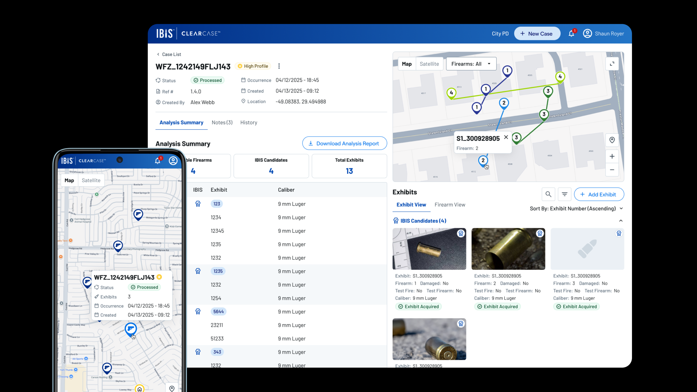
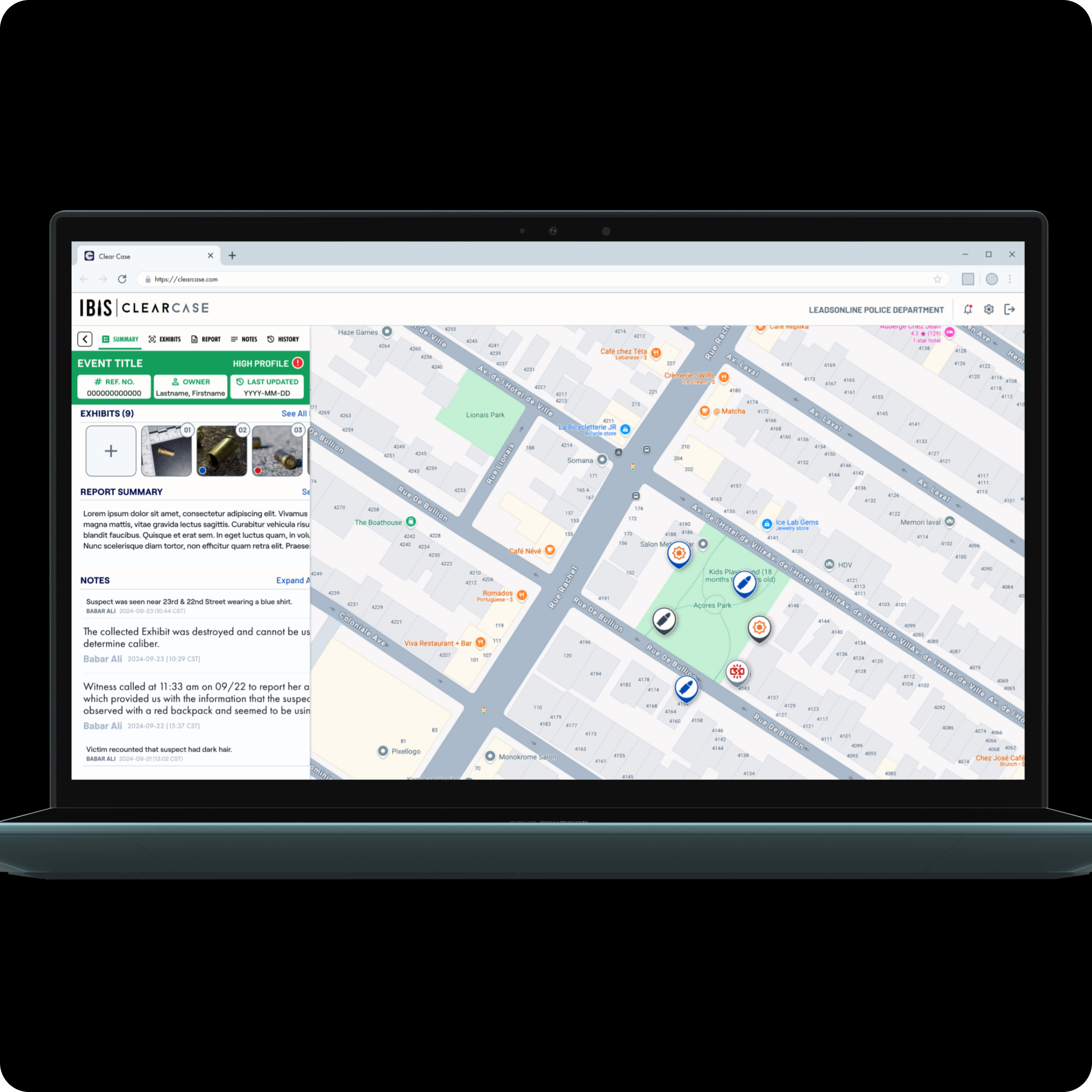
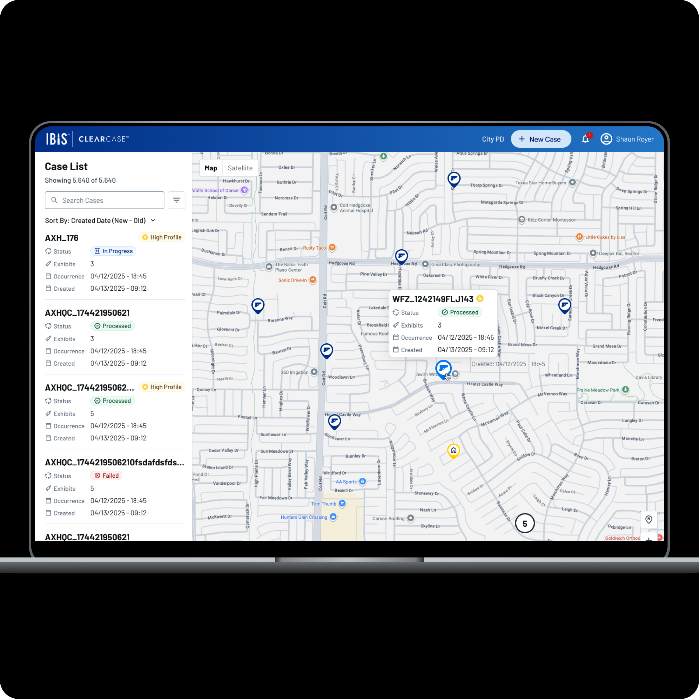
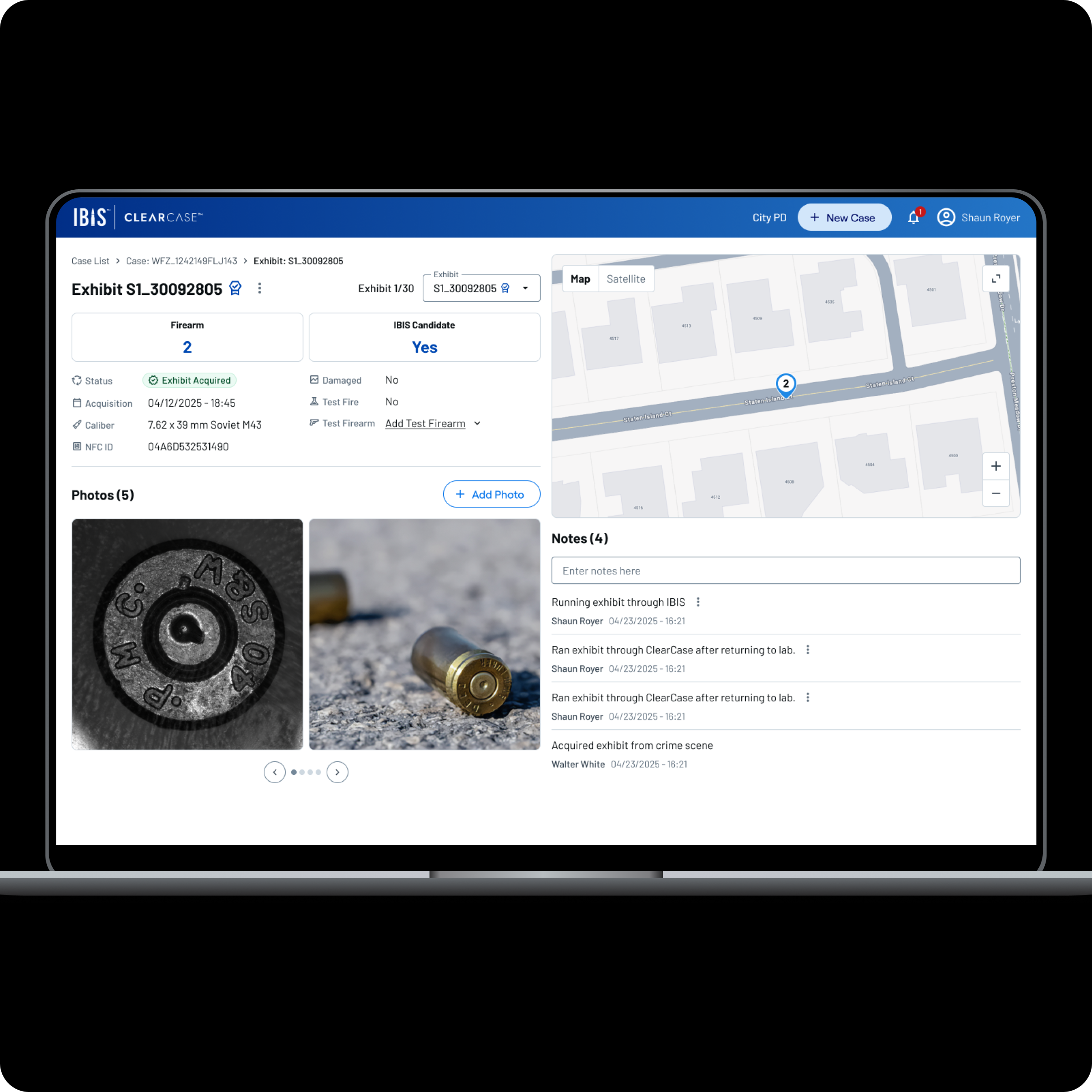
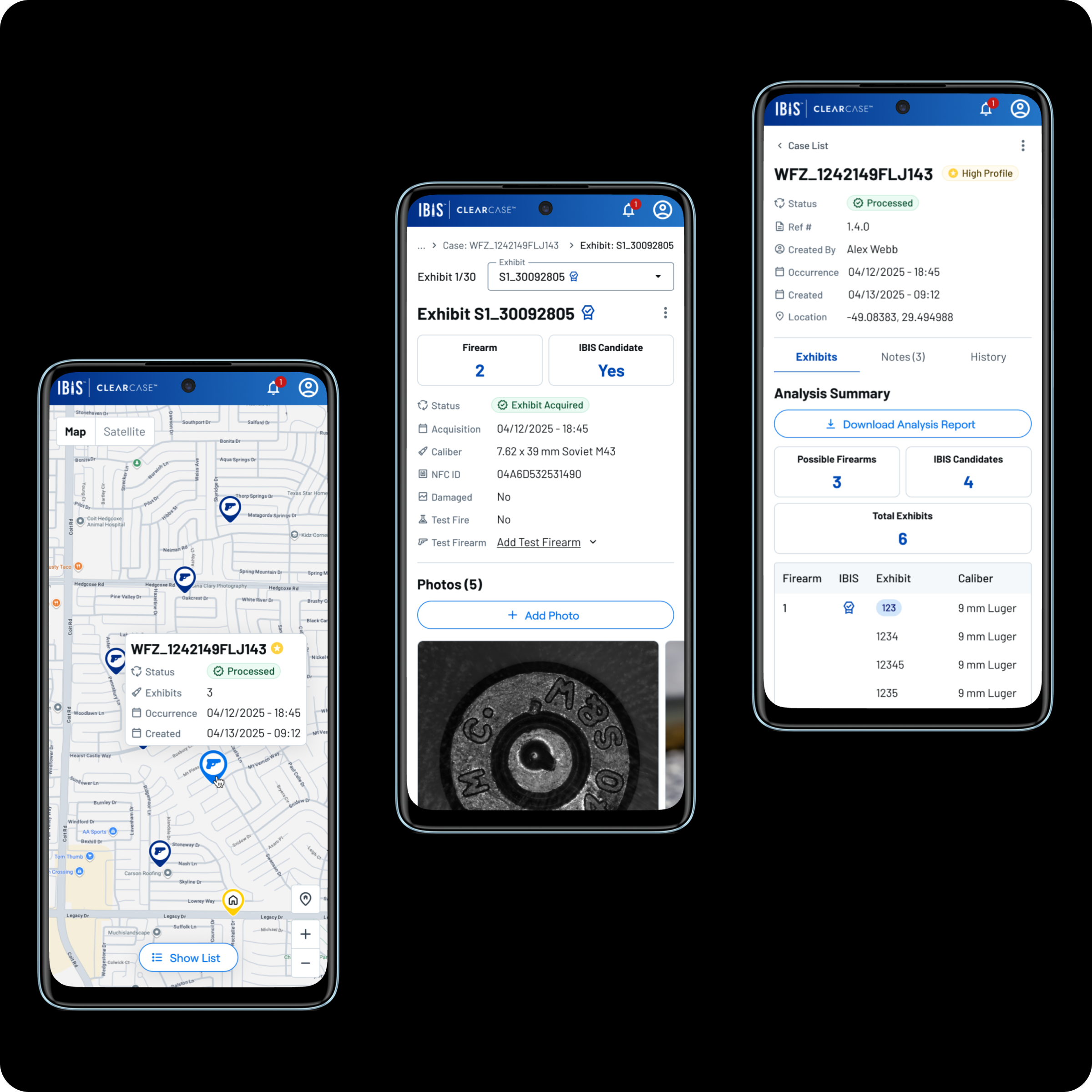
With the platform direction clarified, I redesigned every core web screen around the desktop workflows agencies needed to trust. The case list pairs a searchable, sortable sidebar with a geographic map view. The case detail surfaces the analysis summary, exhibit data, and a downloadable report without extra clicks. The exhibit detail consolidates photos, metadata, notes, and location into a single view.
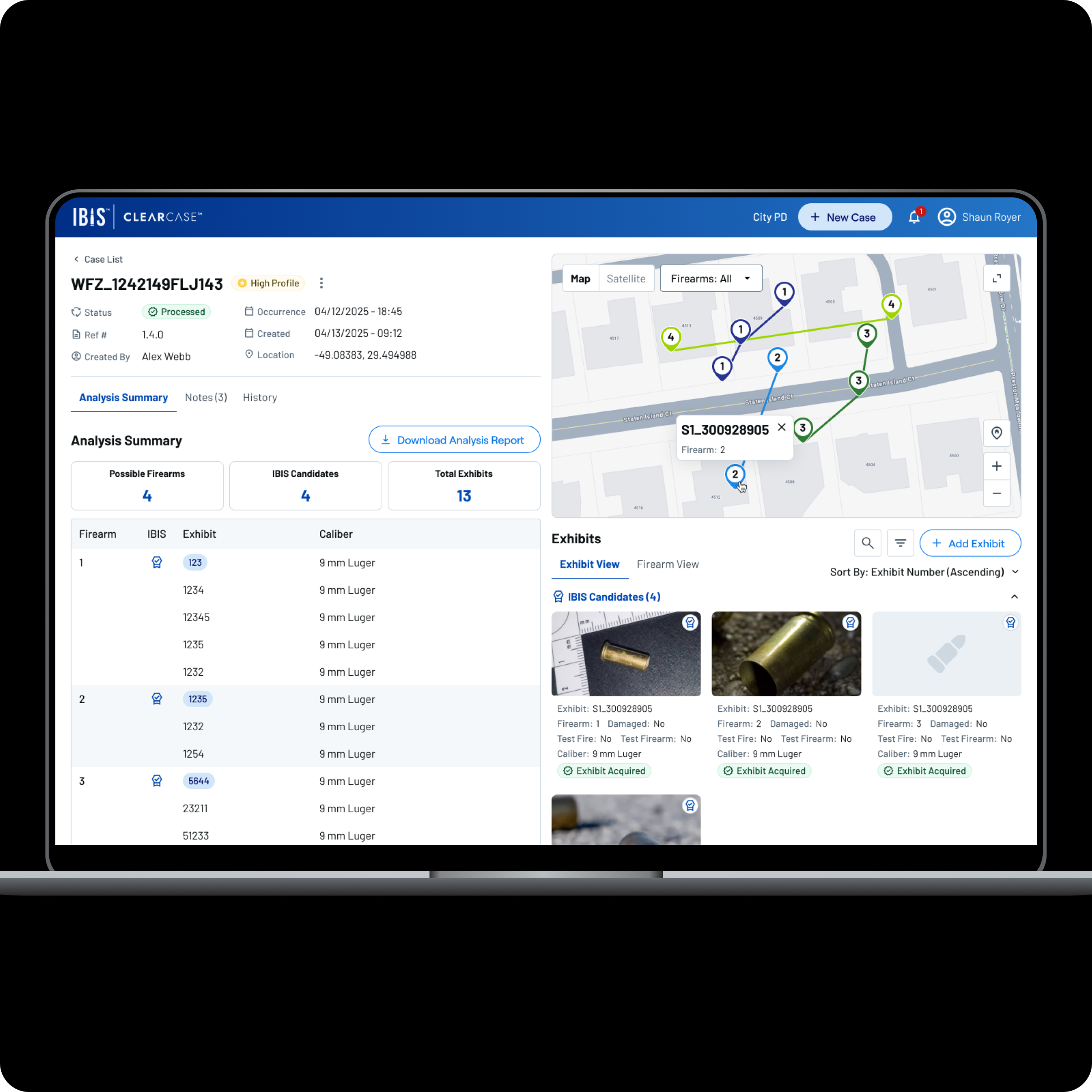
The Critical Workflow Gap
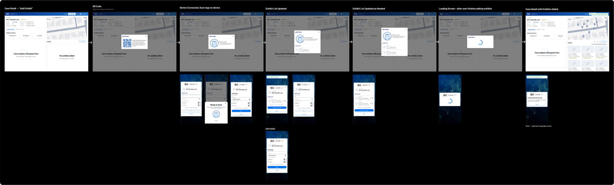
The redesign would have failed if the web app still could not support exhibit submission. Agencies needed to investigate evidence, add exhibits, and process cases through the platform. But the web product had no way to add exhibits, while the mobile app was a legal and operational concern for some customers.
Why mobile-only was a non-starter
Case data stored on a phone, whether personal or work-issued, can be subpoenaed as evidence. Investigators risked losing their device during proceedings, making agencies reluctant to adopt a mobile-only workflow for something as critical as exhibit entry.
Web-Based Exhibit Creation
I advocated for web-based exhibit submission because it represented the platform's core job-to-be-done. In collaboration with engineering, I designed a flow that bridges web and mobile: investigators initiate exhibit creation from the web, scan cartridge cases using the phone's NFC reader via QR code pairing, and the exhibit list updates in real time, all without storing case data on the device. This workflow is now live in production.
Impact
The launch gave ClearCase more than a cleaner interface. It removed a core adoption barrier, modernized the platform direction, and supported the business case for ClearCase as a growth product.
Business growth
North American sales reached 256% of plan within four months of launch, helping validate ClearCase as a primary growth driver for the ballistics division.
Workflow completion
Agencies can now complete evidence submission through the web experience instead of depending on a mobile-only workflow that some customers were reluctant to adopt.
Platform modernization
The project helped move ClearCase away from a constrained shared codebase and toward independent web and mobile platforms with clearer product ownership.
Production launch
The redesign, responsive layout, design system integration, and exhibit creation flow shipped together and are now live in active customer workflows.
Reflection
Strategy before screens
Starting with an audit before touching the design made it clear that the product problem was bigger than visual cleanup. The exhibit creation gap and platform constraint needed to shape the strategy before the UI could be effective.
Adoption depends on the full job
A product can be technically impressive and still miss adoption if customers cannot complete the job they bought it for. Web-based exhibit submission was not an edge case, it was the point.
Design can clarify architecture
The redesign exposed where shared mobile and web assumptions were holding the product back. Making those constraints visible helped product and engineering align around a direction that could support growth.